-
Economic Perspectives
Consumer Sentiment: Why economists say “yay!” but consumers say “nay”
April 2024
- Filename
- Economic Perspectives APRIL 2024.pdf
- Format
- application/pdf
TRANSCRIPT
Economists face an interesting conundrum. There’s a large gap between how the economy has been performing and how Americans feel about the economy. In a recent Wall Street Journal survey, by a 2-1 ratio, respondents say that the economy has gotten worse, rather than better, over the past two years.
Yet, in reality, the opposite is true. For that period, the unemployment rate has been below 4%, a level that is considered full employment, and something that we have not seen since the 1960s. The number of job openings compared to the number of people looking for jobs is very strong. There are 1.4 jobs available for every person looking for a job, and household net worth is at an all-time high, reflecting the strength of their financial assets and the values of their homes. And finally, GDP growth. Over the past year, it's been up 3%, well above the trend rate of 2%.
Yet, consumer sentiment is at low levels: What gives? It might be partly because of the attitude shifts since the pandemic – we've seen this before. Parents of baby boomers, those that lived through the Great Depression or World War II, became very austere. They saved a lot and were frugal in their spending. They knew that one could lose their wealth or livelihood very, very quickly.
Well, the opposite seems to be true this time around in the post-pandemic period. People have realized that someone close to them could quickly lose their life, so the best thing to do is spend time and money with family and friends, so there have been high spending levels and very low savings rates.
The acronym YOLO is often used: You Only Live Once. These days, we are seeing that people have little tolerance for not getting what they want. They are also worried about the looming geopolitical risks of two ongoing, and possibly expanding, wars, as well as a dysfunctional Congress that has passed very little legislation.
So, let's turn to some of the charts.
Consumer Sentiment: University of Michigan
index, not seasonally adjusted
Data current as of April 25, 2024
Sources: University of Michigan
Information is subject to change and is not a guarantee of future results.
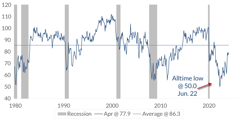
Chart 1 2:28– This first chart shows Consumer Sentiment. The data has been around since the late 1970s, and there are a couple of noticeable issues. It is currently below the long-term average, and it's also below the pre-pandemic level. But what's interesting is the point that the all-time low was in June 2022.
What was going on then? What was so bad? Well, the Fed had begun raising the federal funds rate just a few months earlier, and it was making plans to increase the interest rate moves that they made for the future. The stock market had traded off 25%, but food prices were moving up quickly, more than 13% year over year. That's something that we had not seen since the 1970s.
Gasoline prices hit a high of around five dollars a gallon. Was that worse than the pandemic before the vaccine? Or the global financial crisis, when almost nine million people lost their jobs, the stock market fell by about 50%, and home values fell by about one-third? Clearly, 2022 was not as severe as then, but that's where it stands. So, let's go look at the data in greater detail.
Consumer Sentiment: Income Bracket
University of Michigan value, not seasonally adjusted

Data current as of April 25, 2024
Source: University of Michigan
Information is subject to change and is not a guarantee of future results.
Chart 2 3:40– This chart shows sentiment among the three major income groups. The sentiment remains below the pre-pandemic level.
Consumer Sentiment: Education
University of Michigan value, not seasonally adjusted
Data current as of April 25, 2024
Source: University of Michigan
Information is subject to change and is not a guarantee of future results.
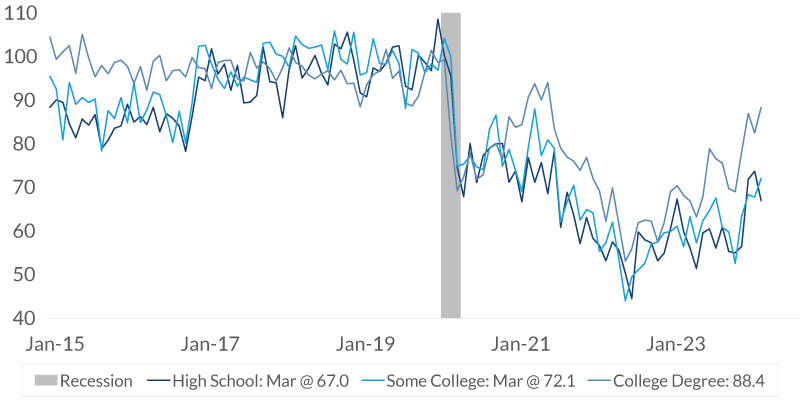
Chart 3 3:48– This chart shows sentiment among three different levels of education. Again, the sentiment remains below the pre-pandemic level.
Consumer Sentiment: Age
University of Michigan value, not seasonally adjusted
Data current as of April 25, 2024
Source: University of Michigan
Information is subject to change and is not a guarantee of future results.
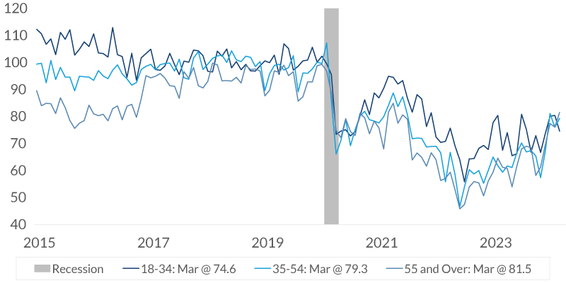
Chart 4 3:55– This final chart shows sentiment among different age groups, and, again, the sentiment remains below the pre-pandemic level. So, the lower sentiment levels are generally broadly based, no matter how you slice or dice the data.
However, there is one group of cohorts with a separation of views, and it will not surprise you. It's among primary political party affiliations.
Consumer Sentiment: Political Parties
University of Michigan value, not seasonally adjusted
Data current as of April 25, 2024
Source: University of Michigan
Information is subject to change and is not a guarantee of future results.
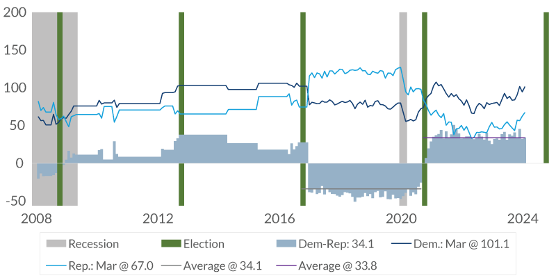
Chart 5 4:18– This data only goes back to 2008 for a full year of data. The green columns indicate when elections occurred. The gray represents, of course, recessionary periods. The dark blue line that you see here is the attitude of Democrats, while the bright blue line is that of Republicans. The blue-gray shaded area, of course, is the difference between the two.
It is evident in this chart that, when a Democrat is in the White House, Democrats have a more favorable outlook. When a Republican is in the White House, Republicans have a more favorable outlook. Since 2008, the gap between the two has widened as the population has become more polarized in their political views. It is interesting to note that the gap between the two, and the current and past administrations, is about the same. It was 34.1 when Donald Trump was president, and it stands at 33.8 with Joe Biden as the president.
Household Assets and Liabilities as a Percent of GDP
Data current as of April 25, 2024
Sources: Federal Reserve Bank, Bureau of Economic Analysis
Information is subject to change and is not a guarantee of future results.
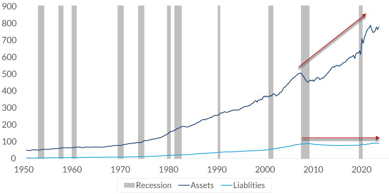
Chart 6 5:14– Now, let's take a look at what's going on with the economy. This chart shows the growth in household assets and liabilities as a percent of GDP. Asset growth has outpaced the growth of the economy for the past decade or so. At the same time, liabilities have remained relatively stable. The balance sheet of households has been an improving story.
Daily News Economic Sentiment
%, diffusion index, not seasonally adjusted
Data current as of April 25, 2024
Sources: Federal Reserve Bank, Bureau of Economic Analysis
Information is subject to change and is not a guarantee of future results.
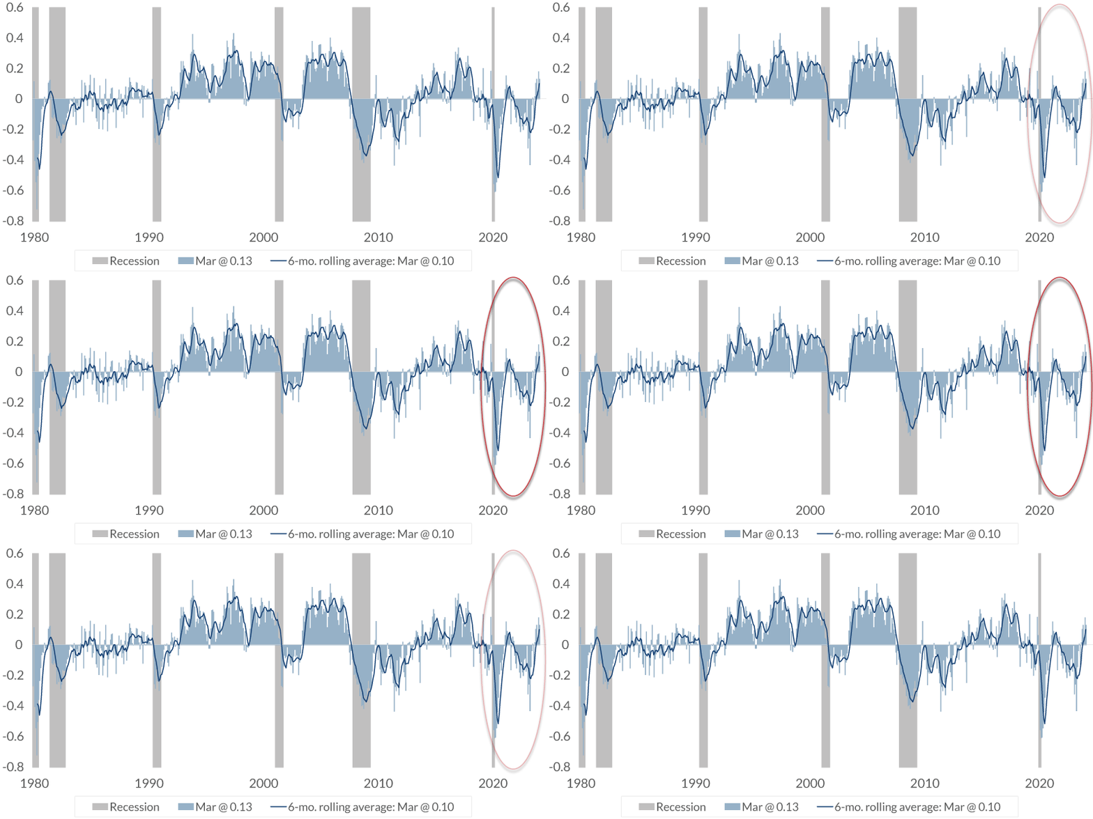
Chart 7 5:37– This chart is an excellent report from the Federal Reserve Bank of San Francisco. This is high-frequency data. It is released daily, and it measures the economic sentiment, based on the linguistic analysis of economy-related news. It's volatile, so the dark blue line is the six-month rolling average. Generally speaking, in expansionary periods it is positive, and turns negative in the periods following recession.
This focuses on recent news. It's been on an upward trend since last June, about the same time that it was becoming clear that the well-publicized expectations of a recession had been inaccurate.
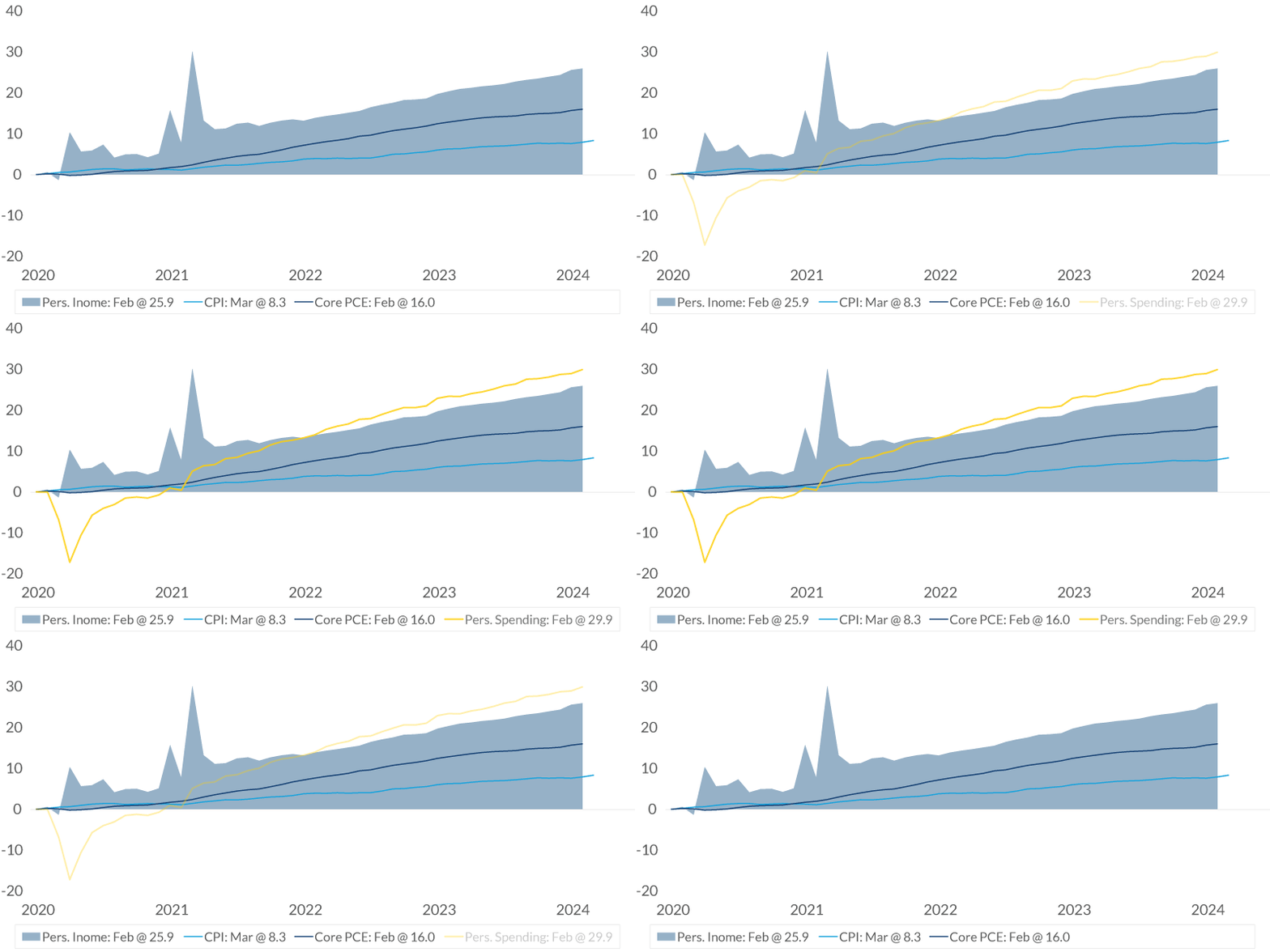
Income, Inflation, & Spending
%, indexed at 0.0 on January 2020
Data current as of April 25, 2024
Source: Bureau of Economic Analysis, Bureau of Labor Statistics
Information is subject to change and is not a guarantee of future results.
Chart 8 6:18– For many households, income is important. The blue-gray shaded area that you see here is the change in household income. The three spikes on the left side indicate when stimulus checks were sent out. The two blue lines that you see here show the change in inflation. The bright blue is CPI. The navy blue is core PCE price index. No matter what your favorite inflation measurement is, income has helped pace inflation. The line here shows personal spending.
Household spending has outpaced household income. In part, this is because many people have refinanced their loans, such as mortgages, which has provided more positive monthly cash flow. Many have also been spending some of their savings from the pandemic period. So, all of this is good fundamental news for the economy, but some areas of the economy annoy people.
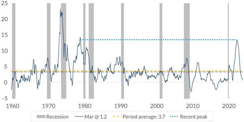
CPI: Food at Home
% change, y-o-y, seasonally adjusted
Data current as of April 25, 2024
Source: Bureau of Labor Statistics
Information is subject to change and is not a guarantee of future results.
Chart 9 7:13– At the top of the list is food prices. This chart shows the yearly change in food at home. You can see the spike in 2022 that I spoke about earlier. Although food prices have risen at just 1.2% in the past year, which is about one-third of the long-term average, the public looks at it a little differently. They are just comparing the prices that they used to pay with what they have to pay now.
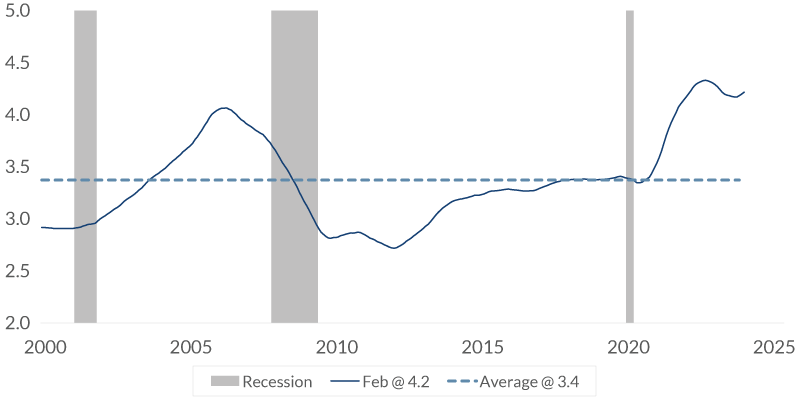
Relative Home Cost
%, median existing home price/median family income
Data current as of April 25, 2024
Source: Bureau of Labor Statistics
Information is subject to change and is not a guarantee of future results.
Chart 10 7:39– Another concern is the price of housing. Although those who already own a home and may very well have a mortgage below 4% that's locked in may not be feeling the pressure, housing costs weigh on many Americans who don’t own their homes. Here, you can see the home cost relative to the median family income with a home price at 4.2 times the median household income. It's very expensive.
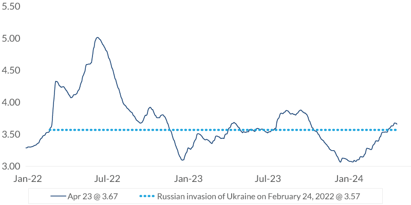
Gasoline
$ per gallon
Data current as of April 25, 2024
Source: American Automobile Association
Information is subject to change and is not a guarantee of future results.
Chart 11 8:02– Gasoline prices are another concern. Although prices haven't changed much since Russia invaded Ukraine, they have been increasing since December, and that, of course, raises concerns for many people.
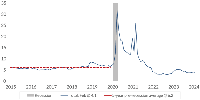
Personal Savings
%, seasonally adjusted
Data current as of April 25, 2024
Source: Bureau of Labor Statistics
Information is subject to change and is not a guarantee of future results.
Chart 12 8:17– This final chart is personal savings. At 4.1%, it is below the 6.2% average for the five years before the pandemic, and I think this is the strongest indicator of how the public really feels about the economy. This is where the rubber meets the road. It measures the differential between income and spending, and it shows the strong economy that we have. If the public were really concerned about the future, do you think they would have a low or high savings rate?
Chart 1: Consumer Sentiment: University of Michigan
index, not seasonally adjusted

Data current as of April 25, 2024
Sources: University of Michigan
Information is subject to change and is not a guarantee of future results.
If they were concerned, they would probably be increasing their savings, not reducing it, especially on discretionary spending. Remember the first chart, with the low point in sentiment index back in June 2022? Well, at the time, the unemployment rate was at 3.6%, which is not much different than today's 3.8%.
Since then, almost six million people have been added to the payroll. Wealth creation has been very strong, with the stock market up by about a third. Economists have long said that consumer sentiment is not an accurate predictor of the future, and we're seeing that play out. But inflation seems to be the source of concern for many in America. This economy has not seen high inflation since the early 1990s. So, although it's an improving story where we see the rate declining, it takes time for the public to notice it.
Important Information
The views expressed represent the opinions of City National Rochdale, LLC (CNR) which are subject to change and are not intended as a forecast or guarantee of future results. Stated information is provided for informational purposes only, and should not be perceived as personalized investment, financial, legal or tax advice or a recommendation for any security. It is derived from proprietary and non-proprietary sources which have not been independently verified for accuracy or completeness. While CNR believes the information to be accurate and reliable, we do not claim or have responsibility for its completeness, accuracy, or reliability. Statements of future expectations, estimates, projections, and other forward-looking statements are based on available information and management's view as of the time of these statements. Accordingly, such statements are inherently speculative as they are based on assumptions which may involve known and unknown risks and uncertainties. Actual results, performance or events may differ materially from those expressed or implied in such statements. All investing is subject to risk, including the possible loss of the money you invest. As with any investment strategy, there is no guarantee that investment objectives will be met, and investors may lose money. Diversification does not ensure a profit or protect against a loss in a declining market. Past performance is no guarantee of future performance.
All investing is subject to risk, including the possible loss of the money you invest. As with any investment strategy, there is no guarantee that investment objectives will be met, and investors may lose money. Diversification does not ensure a profit or protect against a loss in a declining market. Past performance is no guarantee of future performance.
City National Rochdale, LLC, is a SEC-registered investment adviser and wholly owned subsidiary of City National Bank. Registration as an investment adviser does not imply any level of skill or expertise. City National Bank and City National Rochdale are subsidiaries of Royal Bank of Canada. City National Bank provides investment management services through its subadvisoryrelationship with City National Rochdale, LLC. City National Bank and City National Rochdale are subsidiaries of Royal Bank of Canada.
© 2024 City National Bank. All rights reserved.
CITY NATIONAL ROCHDALE, LLC NON-DEPOSIT INVESTMENT PRODUCTS ARE: • NOT FDIC INSURED •NOT BANK GUARANTEED •MAY LOSE VALUE
Stay Informed.
Get our Insights delivered straight to your inbox.
Put our insights to work for you.
If you have a client with more than $1 million in investable assets and want to find out about the benefits of our intelligently personalized portfolio management, speak with an investment consultant near you today.
If you’re a high-net-worth client who's interested in adding an experienced investment manager to your financial team, learn more about working with us here.


